When I’d first started out as a coach, I picked a business name rather than using my name, much like when I first started blogging and chose to do so anonymously. But the longer I’ve coached (like the longer I blogged) I felt I was hiding… and for no good reason. So, when I discovered I was able to buy my domain name in a .com format, I nabbed it and started to use it for my coaching business.
Hanging around LinkedIn – as I’ve been doing for the past year – you hear about all kinds of stuff on the periphery of business. Personal branding was one of those things. Initially, I didn’t give it a great deal of thought, as I had so many other things on my to do list.
Many months later, a friend and fellow coach shared details of her personal branding experience when working with someone I’d earmarked as a potential. And I have to say, it all looked and sounded rather splendid, so I actively put it on my list – even if it was a long way from the top.
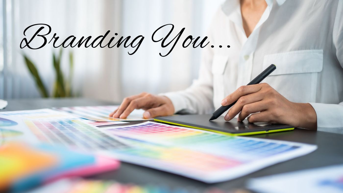
Then, the person who’d done that rather splendid branding asked for beta testers for a new simplified and stripped down branding package. And as one of the reasons I’d not considered working on this right away was that I like fiddling around with graphics myself so wasn’t looking for the full works, I was delighted to put my hand up for the most stripped down option.
The only thought I’d previously given to “branding” was in the selection of colours for use on my website and in social media. Over the different iterations I’ve chosen those on the blue to green spectrum as, based on colour psychology, blue = trust and green = safety. These were also colours I wear – when I’m not wearing black, which is my go to.
Long story short – my personal branding turned out to be a most enjoyable experience.
As we’re in the same network, we got to know each other first over a gin & tonic, chatting about our backgrounds, life to date, how we felt about stuff, all that kind of thing. Once we got together to work, we discussed the business nitty gritty – stuff like my ideal client, the pillars of my business etc. Then we got to the good bit – what I liked in terms of design and style. And the first words out of my mouth were “I’d love a black & white site, but…” The thing is, my day job being in the IT world, I associate black & white as being a plain & simple business site – and I had my doubts it’s a look which would be attractive to the women I’d like to work with. So the idea got filed away, and we focused on my love of Art Deco styling – all angles and glitz.
The first mood board she produced was gorgeous, but I quickly realised that it didn’t really suit my ideal client – because it was far too masculine, so I asked her to change it to Art Nouveau, it being all curves, and decidedly more feminine. Fortunately, I also love that period, and from there, we’ve positively raced along.
Bit by bit, we’ve stripped away the colour, and I’m now re-building my website in monochrome. My branding is black & white… but layered over a pattern in a lovely smoky grey, into which I incorporate black & white photographs. And yes, I am loving being able to incorporate my photography hobby 🙂
All I can say at this stage, is that it feels right. In truth, whilst I’ve been trying to bring more colour into my wardrobe, I do always go Back to Black (hat tip to Amy Winehouse 😉 ).
If you were to be have a personal brand, what do you think you’d like? Colours, design influences, styles, fonts, the works…
© Debra Carey, 2023

I was doing slides for my manuscript consulting side hustle and I kept almost everything monochrome–because black type, white pages. (But I tossed in some gray backgrounds because I am such a rebel.) The difference between my slides and the women who work with kids, or bake or even do real estate is pretty stark. I felt compelled to toss in a few color pictures to brighten up Mordor a bit.
LikeLiked by 1 person
First off, apparently the WordPress prompt today was what brands do you associate with and I asked someone what they thought of brand as per individuals…but anyway…my colors would be black and pink. My font would be like lobster 2, cursive but straight up and down, and my motto would say something like Logic or that vein
LikeLiked by 1 person
I too have spent a lot of time focusing on my personal brand. Like you, I started out blogging anonymously, under names like Swinged Cat and Midwest Mark. But I purchased my own domain name many years ago, and made a concerted effort to roll it all into one when I moved to Wisconsin. I don’t doubt it for a moment.
I focus less on the look and feel of my brand, choosing instead to concentrate on my portfolio and writing work, though that might change someday. I’d pick some combination of purple and orange probably.
LikeLiked by 1 person
I was a marketing executive in my pre-retirement years, so I have thought a lot about branding – both for others and myself. Funny, though, now that I’m retired and writing a blog about whatever pops in my head, all thoughts of personal branding have flown out the window. Maybe I should reconsider 🙂
LikeLiked by 1 person
I love colors, all colors, subtle or bright, and textures and patterns. So I would find it hard to settle down to a personal brand. When I started my blog, I had just published Tiger Tail Soup, a novel about China, and I called my blog “Behind the Story. For a few years most of my posts were about everything Chinese. Now my blog has a tropical look in keeping with my second novel, When in Vanuatu. It’s still called Behind the Story, though. I guess I need to publish more stories. A personal brand seems related to selling something, which really isn’t my interest right now.
LikeLiked by 1 person
Autumn, I wondered if I’d be tempted to use colour sometimes too, but so far, so good. Of course it’s only been a short while…
What made me think that I might was although I went for a monochrome site header here, I tend to create colourful blog headers. But, with the work I’ve done on my professional site so far, I like the peacefulness of the monochrome tones. And hey, if I change my mind, I know how to add colour back in (and have the earlier colourful versions of my current design).
Oh & ha ha to Mordor! Who doesn’t like a bit of drama eh? 😀
LikeLiked by 1 person
Oh wow, that’s quite the co-incidence. I keep meaning to sign up for the WPress prompts, and keep forgetting!
Your picks sound a good combo, and very you. I haven’t included a motto or tagline, but I’m working on it.
LikeLiked by 1 person
Mark, that was kind of my thought on the subject, so I was surprised how much I enjoyed the process.
Purple and orange is a stunning combo 🙂
LikeLiked by 1 person
Janis, I never gave it a thought for my personal blog, it’s only my professional one where I decided to take the leap. But yes, you may find it fun to have a play with the concept, especially as you’re your own expert!
LikeLiked by 1 person
Nicki, I know what you mean about making a choice. That’s why having someone to work with can be so helpful. For example, the colour of my very first professional site was driven by a photograph I’d taken and wanted to use. It was only later than I learned about the psychology behind colour and realised that it had been a good choice.
LikeLike
👍👍
LikeLiked by 1 person
I’ve stuck with black and white because it’s more professional…but at this stage of my career, do I even care about that anymore? I feel like I’m a proven commodity.
LikeLiked by 1 person
My icon is my personal brand. The image is straightforward as am I and in teal for stability. The yellow-green orb in the middle represents spunk. And the casually drawn circle around the orb is for my laidback attitude.
LikeLiked by 1 person
That’s the thing Mark, the quality of the work is what truly matters. I know in the early stages when you’re trying to build a reputation (as I am currently with my coaching), branding and appearances can be important. But when you’ve got as many ex employers contacting you for contract work as you have, you are most certainly a proven commodity. I look forward to seeing that orange and purple scheme…
LikeLiked by 1 person
I like it Ally. Beautifully thought out. I especially like that you’ve got an element representing spunk! I applaud that.
LikeLiked by 1 person
Oh, the power of a good G&T, eh? 😉 Glad it’s all worked out well for you. I think black and white is always classy looking, like a good tuxedo. I know nothing really about fonts, but many years ago I attended a conference where there was a session on web design. A woman I sat near talked at length about Tahoma, which I had never heard of. It’s now my favorite font. – Marty
LikeLiked by 1 person
Tahoma is the font we use at my day job – I think it’s lovely. I’ve gone with a condensed Arial because it happens to work with other aspects of the design, but I was keen to bring Tahoma across to my personal business as well. What an interesting story of how you found it though, I’ve never met anyone who talked about fonts, let alone with passion! Ah yes, G&T for getting a chat going every time 😀
LikeLiked by 1 person